Despite a massive content library with new titles added regularly, a common sentiment among Netflix users is that it is difficult to find something to watch. This leads to decreased user satisfaction and a greater likelihood of subscription cancellations.
Through research I sought to learn how users discover new titles to watch, what their expectations are around content recommendations, and in what contexts they are searching for new content.

Most streaming platforms seem to offer similar features and categories for content, however there is clearly a lack of ability to curate your feed and influence your recommendations.
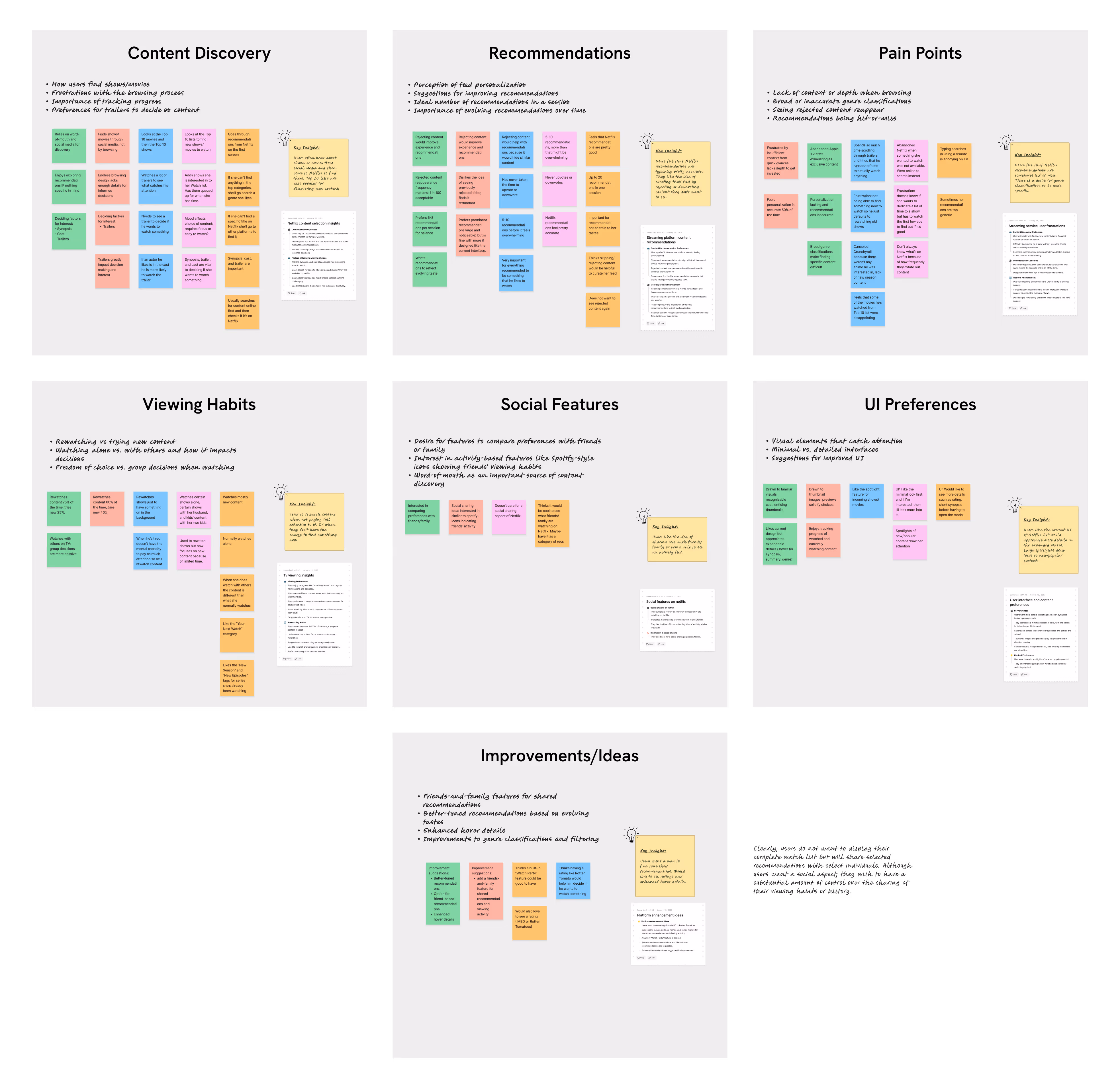
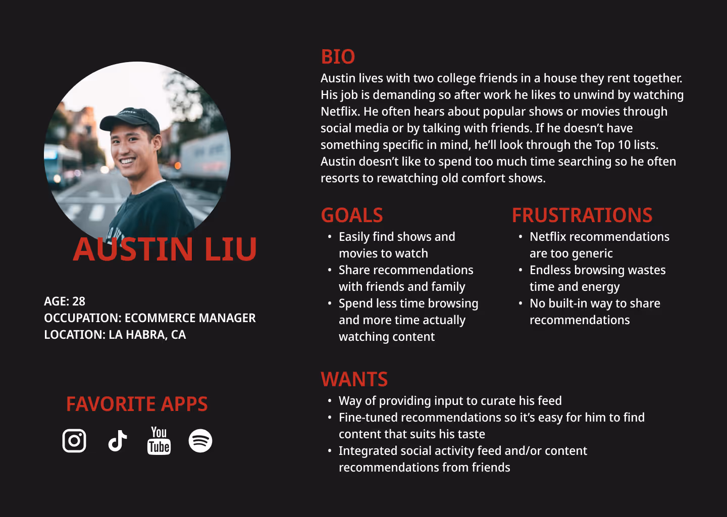
I conducted 5 interviews with Netflix users to understand their preferences, behaviors, and any pain points surrounding the content discovery process. Then I gathered these observations into an affinity map to identify common themes and patterns.
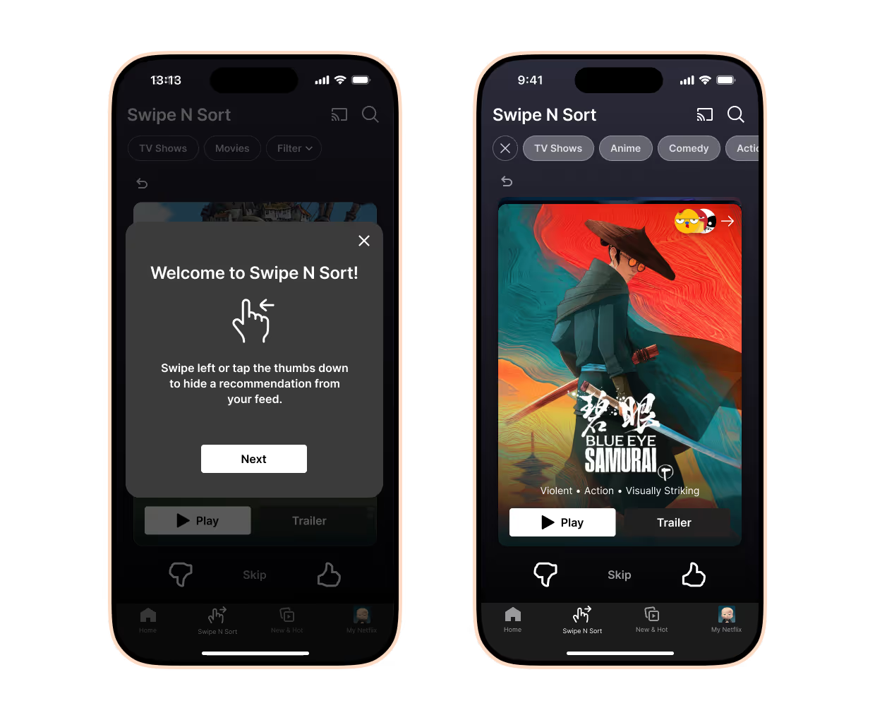
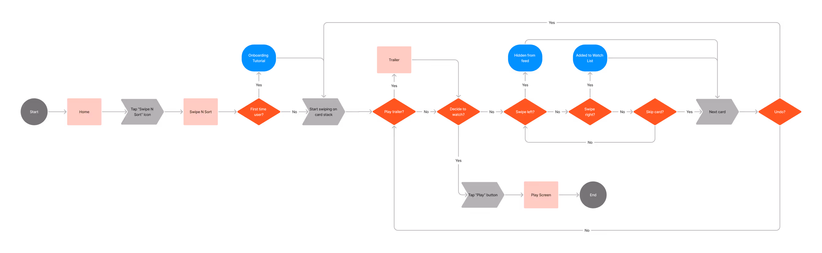
I pondered the best way to allow users to impact their own recommendations through a low-effort, gamified interaction. The common dating app mechanism of swiping left or right on profiles came to mind, and it inspired a kind of "card sorting" design for the feature.
For a quick read on how the basic structure and verbiage would be received, I had 5 participants explore the lo-fi prototype. Here is some of the feedback I got:
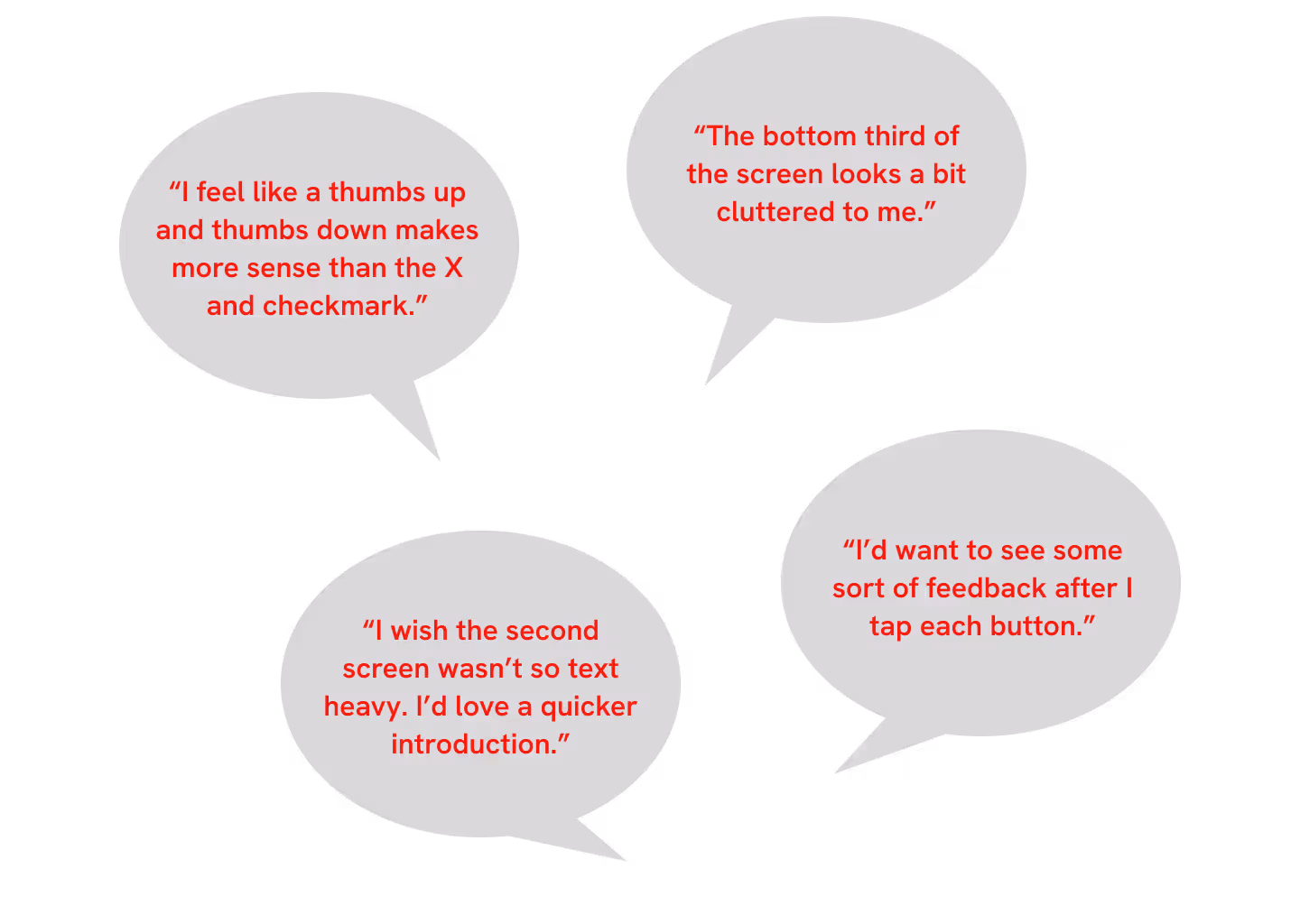
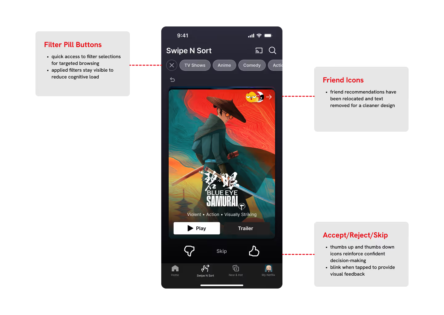
Based on these insights, I decided to make four main revisions for the hi-fidelity prototype:
1. Change the "X" and checkmark to thumbs up and thumbs down icons.
2. Add a subtle feedback animation after each action.
3. Simplify or rearrange the UI on the bottom third of the screen.
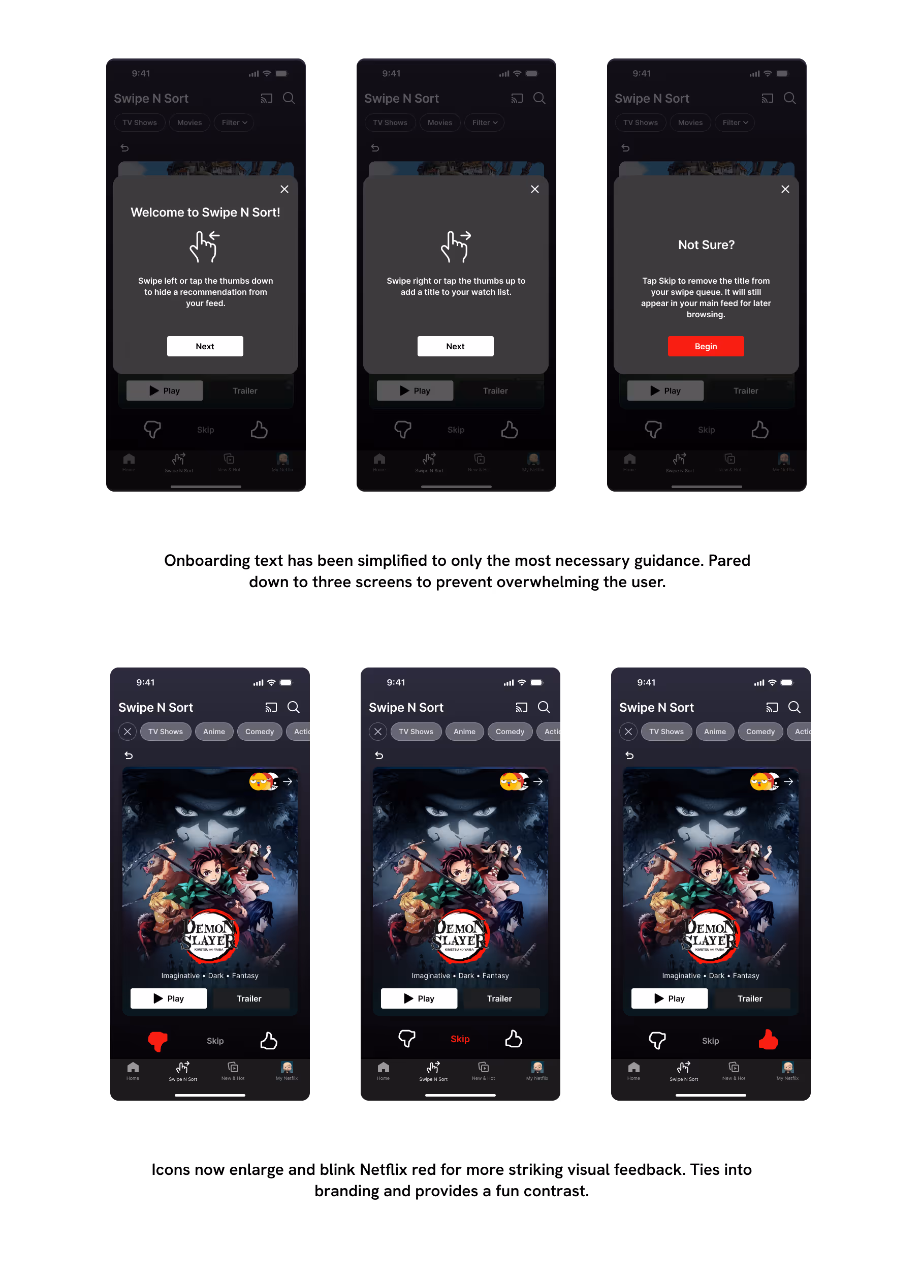
4. Shorten the onboarding flow.
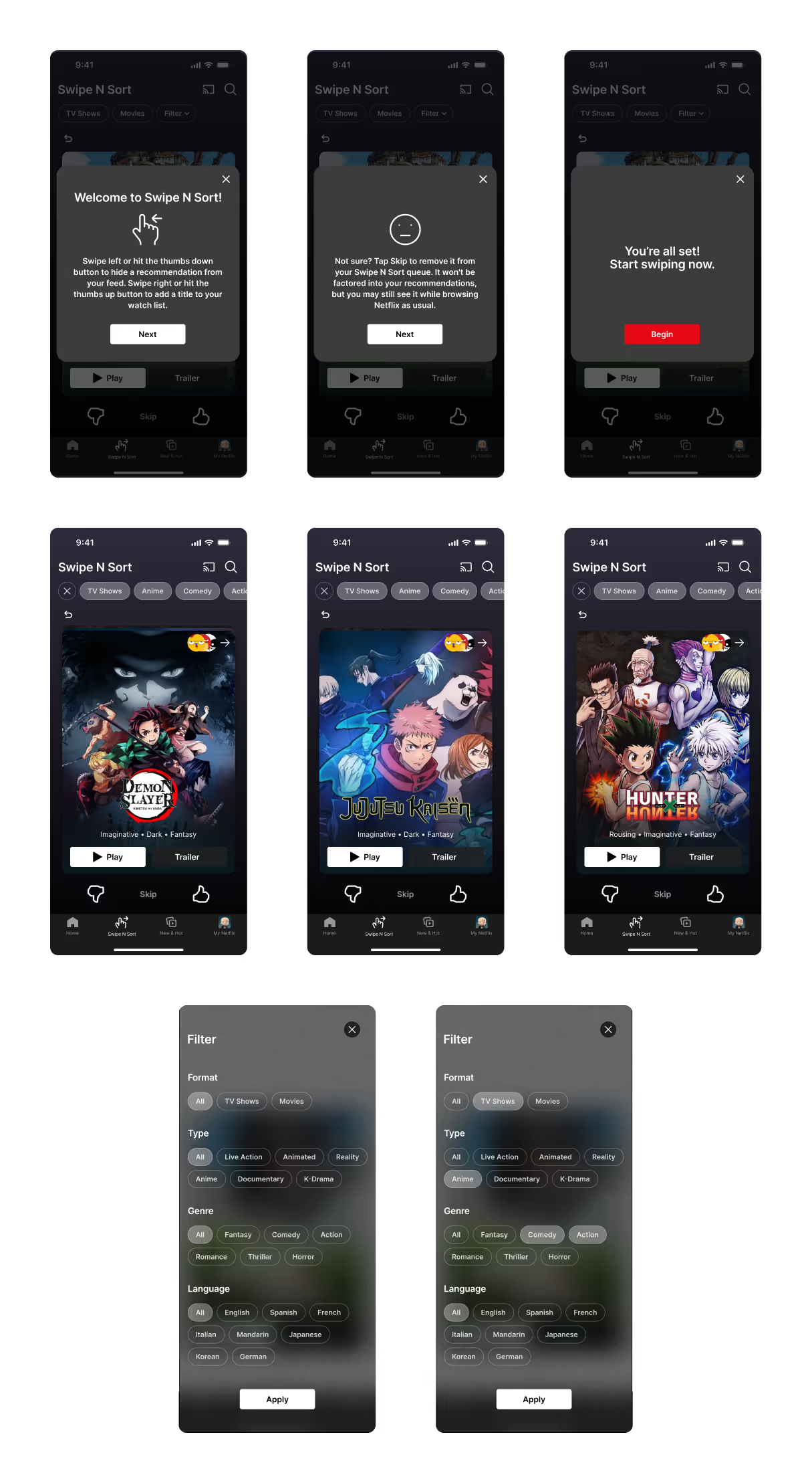
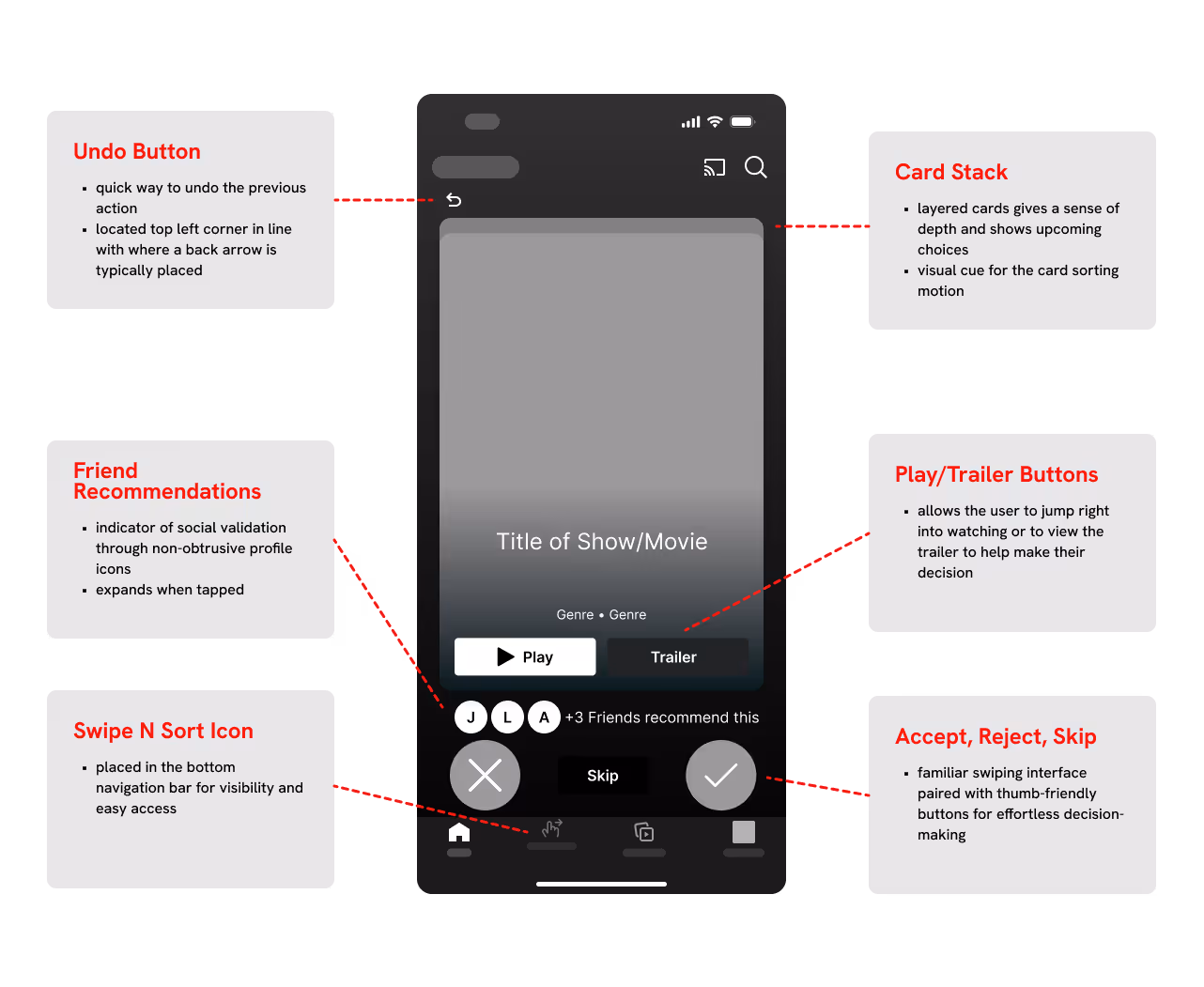
In the hi-fidelity prototype, I built out three flows: onboarding, adding filters, and swiping to choose something to watch. I tested these flows in 5 usability tests and discovered areas that still needed some extra tweaking, but the results were largely validating.
Reduced Decision Fatigue: Prototype testing showed users were able to make quicker decisions because of the focused recommendations.
Increased User Delight: Users expressed the process was more fun and interactive than just scrolling through a feed.
Design Clarity Insights: Feedback from testing helped to refine UX writing and visual cues for enhanced usability.
Prototype Synopses and Ratings: Test a content details feature for users wanting additional context before swiping.
Social Integrations: Validate interest in the "Friend Activity" icons to explore social-driven discovery and recommendations.
Mobile Optimization: Continue to refine accessibility and usability across different screen sizes and devices.