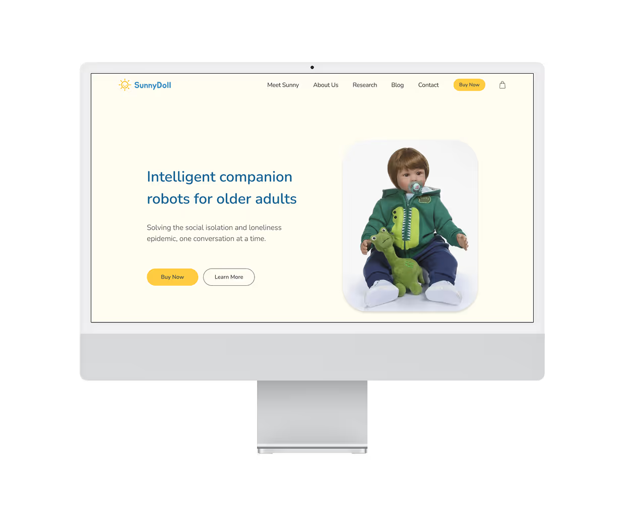
VanTech Med is a woman-led startup dedicated to bringing joy, warmth, and meaning back to the lives of our most vulnerable elderly populations through human-machine interaction. At the heart of this mission is Sunny, an AI-powered companion doll designed to transform senior care. Sunny addresses the widespread challenges of social isolation and loneliness among the aging population, while also alleviating emotional burnout for healthcare staff and providing early detection of emotional health issues in seniors.
Their current website struggles to balance tech and commercial presentation. It lacks sufficient information and emotional engagement. Our team of 3 designers was tasked with creating a new and improved design for the website.
Redesign the website to create a professional yet warm demeanor to support e-commerce sales.
Improve the structure and emotional appeal of the website, ensuring it effectively communicates Sunny's offerings and mission.
Prepare the website for a presale/launch in January 2025.
Our biggest question was what is important to consumers when looking to purchase an AI companion for elderly adults so we can understand how to improve the customer journey. This led us to 3 main research objectives:
1. Observe how customers respond to Van Tech Med’s current website.
2. Learn what information customers need to feel confident in making a purchase.
3. Understand what concerns they might have about AI and safety/privacy.
Our client mentioned that there were a few competitor websites she liked and wanted us to take inspiration from. We conducted an analysis to gain a deeper understanding of the strengths and weaknesses of each design.

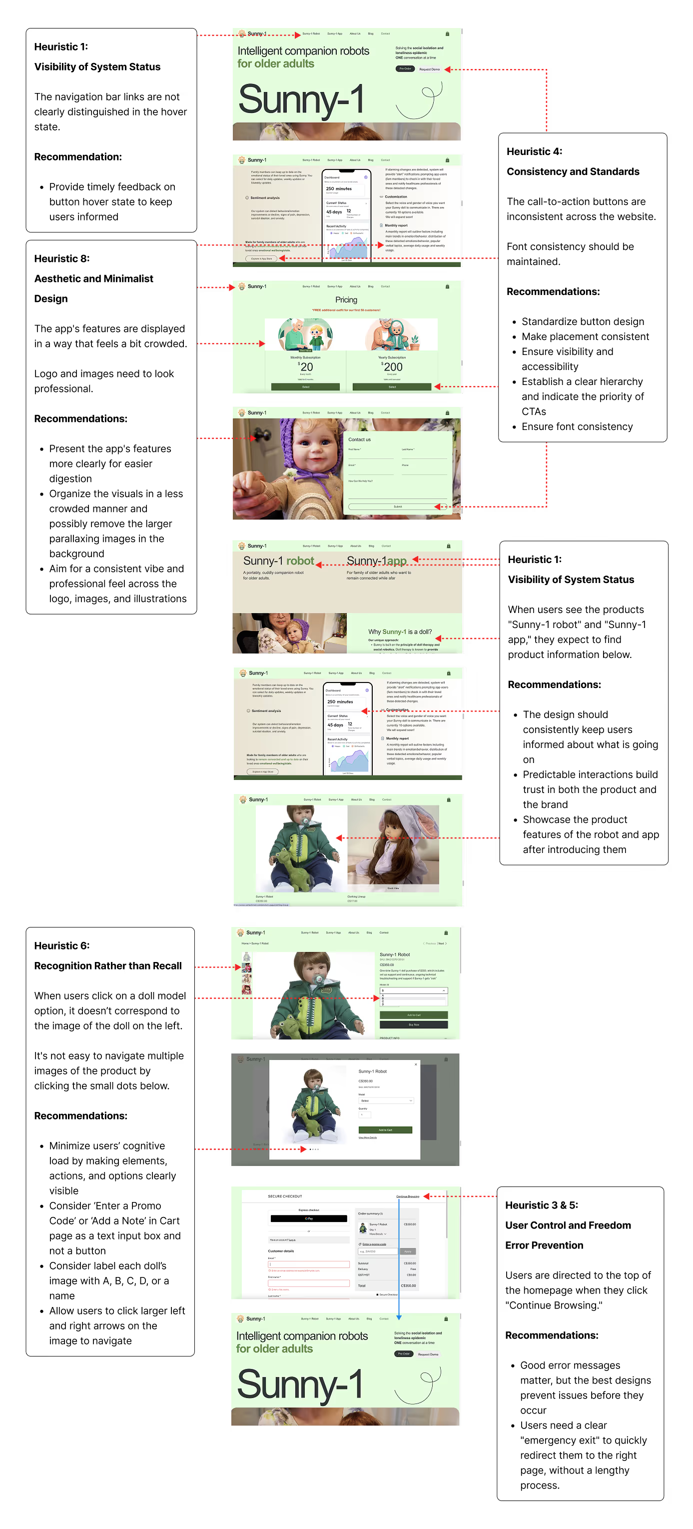
We evaluated their current website using Nielsen's 10 usability heuristics and found a good amount of callouts. This allowed us to identify areas of the website that would benefit the most from a thoughtful redesign.
We interviewed 6 participants in total, asking them to go through the current website and share their thoughts and ratings for ease of use, clarity, and quality of information. We synthesized the data with an affinity map.

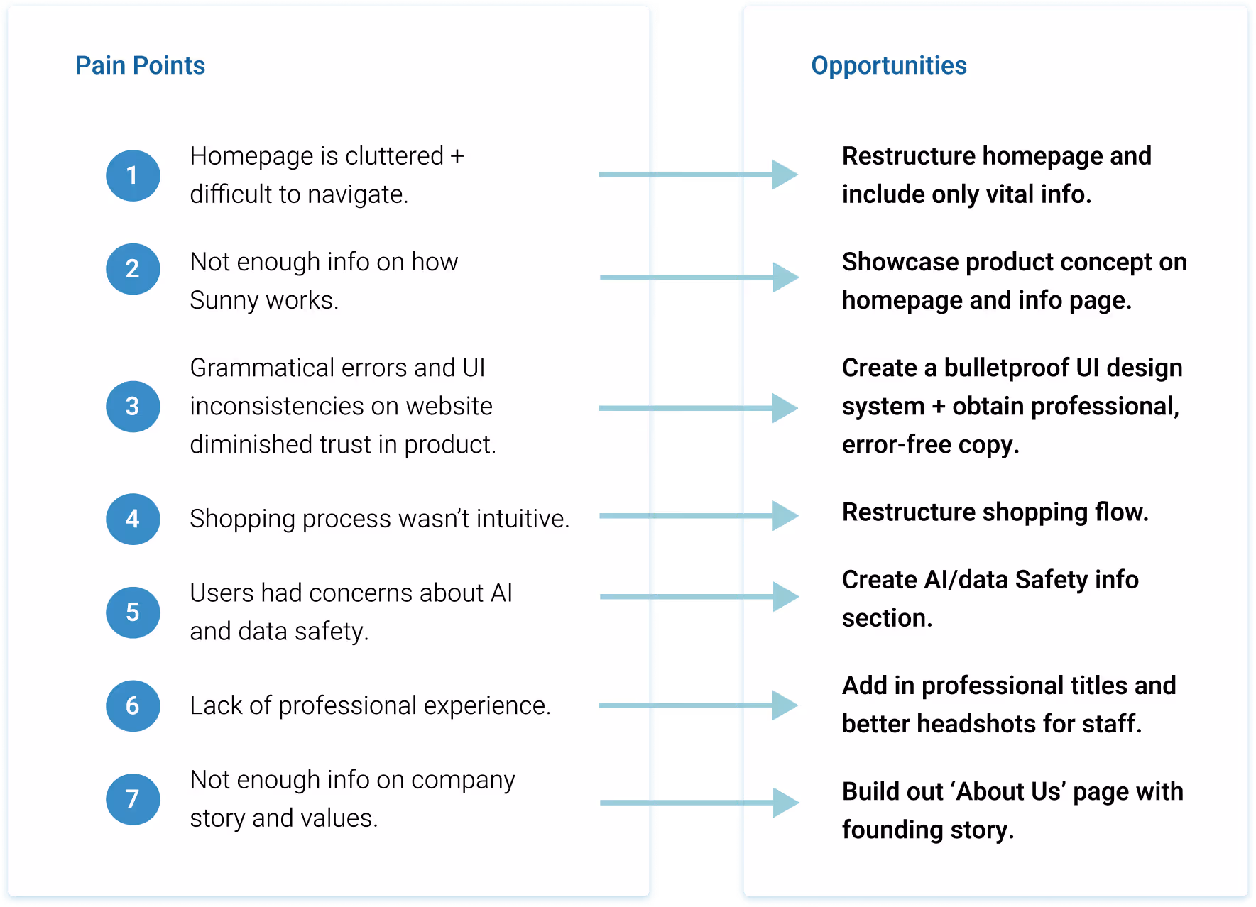
Many of them had trouble finding what they needed on the site and expressed concerns over a lack of vital information. Overall, issues with the website's organization, design, and content significantly disrupted the user experience, undermining customers' trust in both the company and its products.
Once we had identified user pain points, we translated them into opportunities for the redesign.
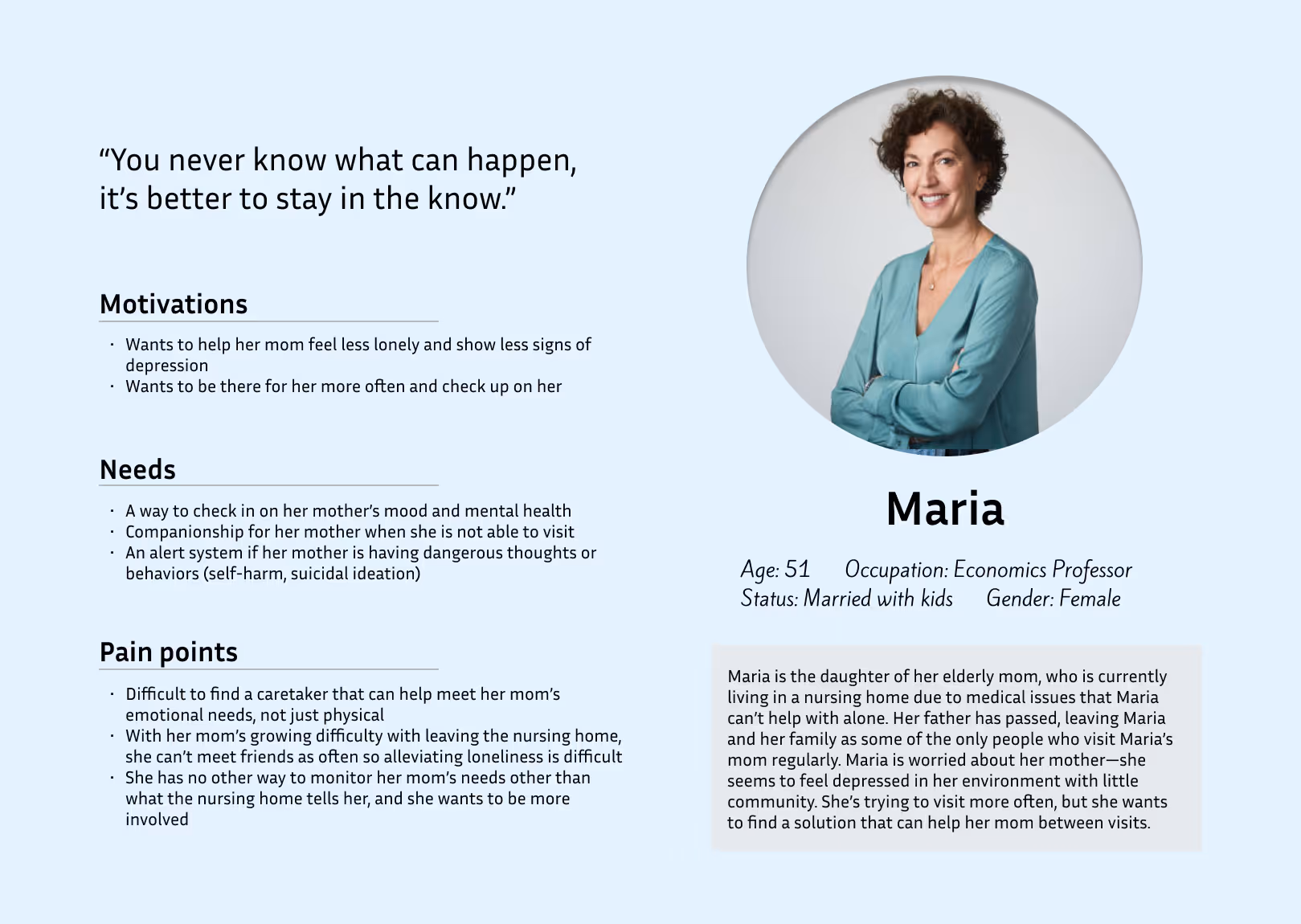
After speaking with our client, we learned more about the unique needs and concerns of an individual looking to purchase this type of AI companion doll. We gathered those notes along with our research and came up with this user persona.
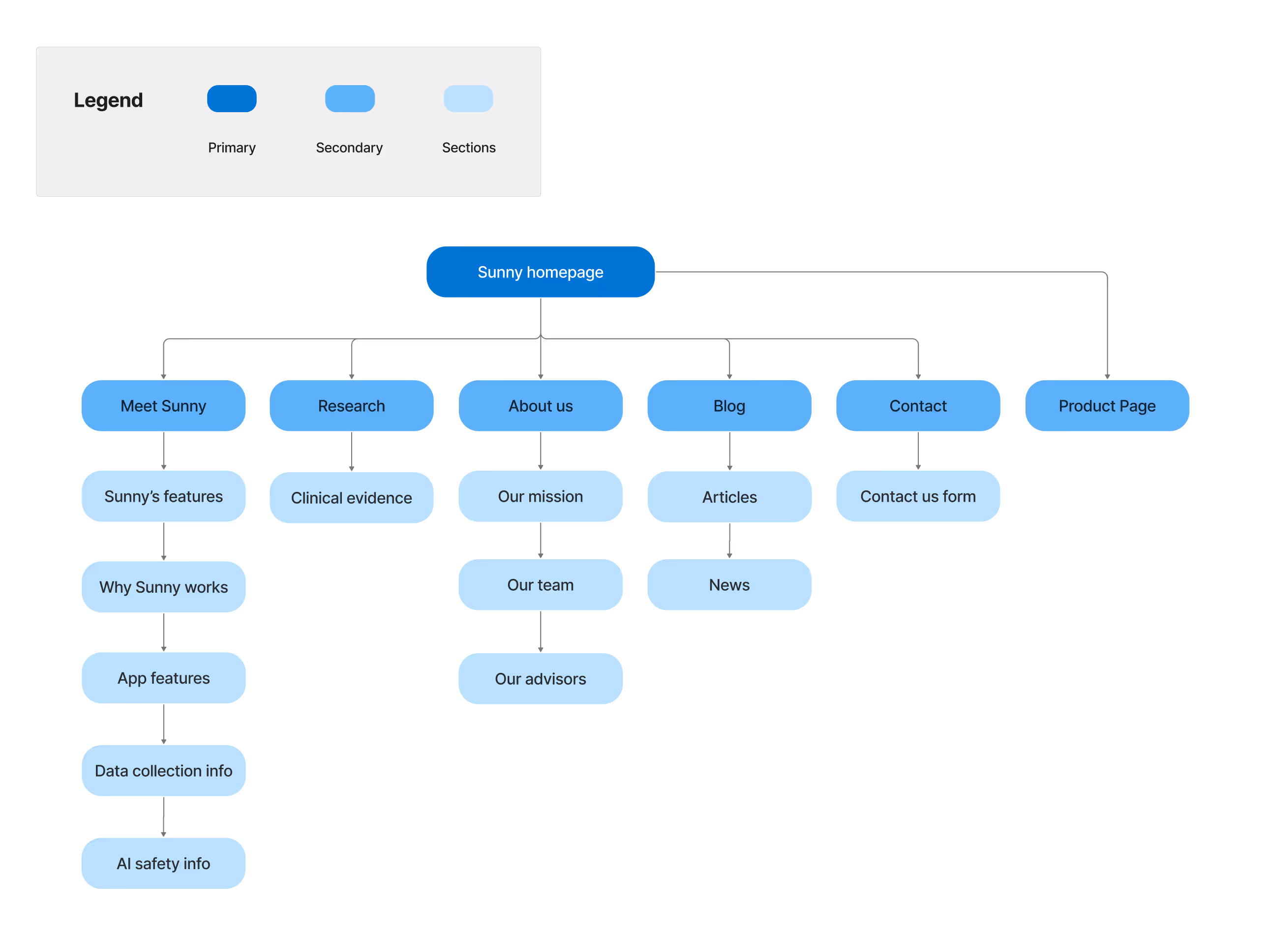
We decided to focus on building out 5 main pages: Homepage, Meet Sunny (product Info), About Us, Research, and Buy Now (product page).
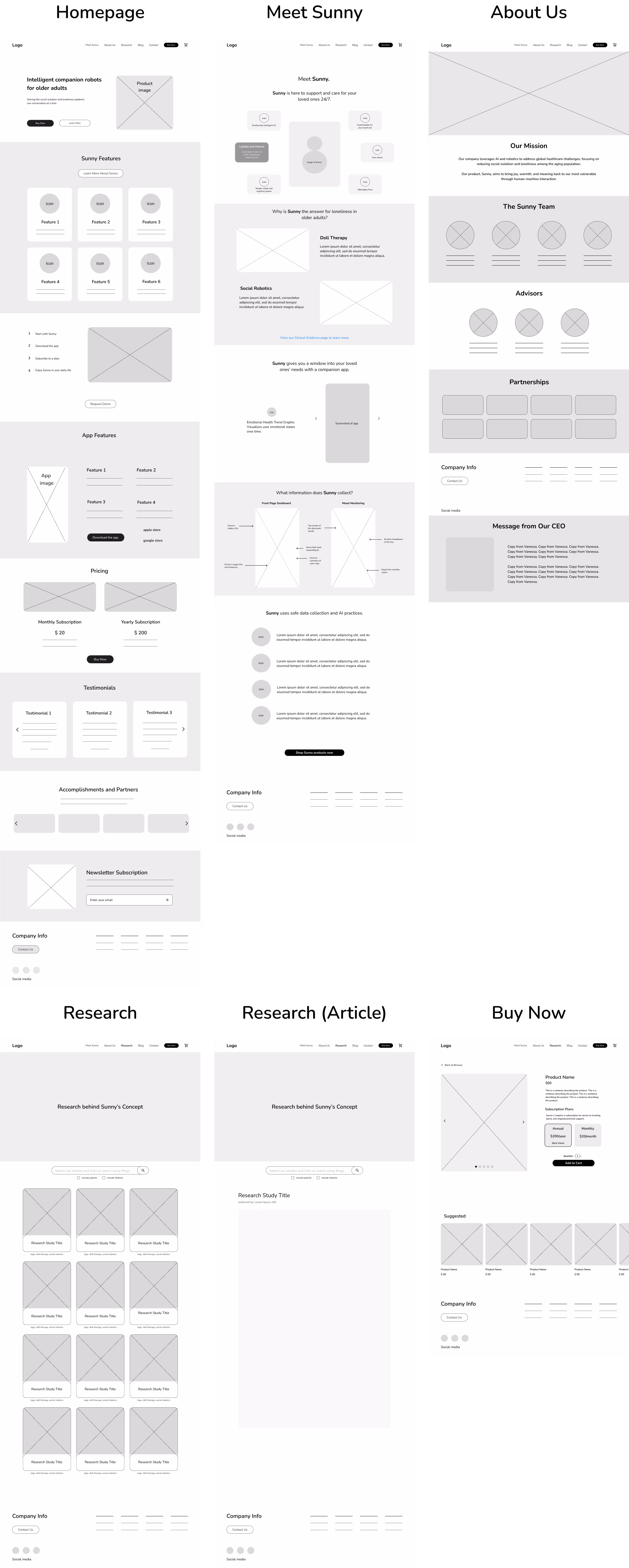
Once we got the lo-fi wireframes approved by our client, we moved onto high fidelity. Van Tech Med came into the project with a preexisting logo and brand colors for SunnyDoll, but we took what they gave us and fleshed out a more comprehensive brand identity.
We also had a meeting with the company's team of 3 web developers to discuss what was feasible in terms of interactions and animations across the website. We promised to hand off a full UI kit in addition to our high fidelity wireframes with select mobile screens to facilitate a smooth launch for their January 2025 presale.
At this point we were still missing assets that were promised to us by the client so we made do with what we had and what we could glean from their old website.
To determine if our redesign accomplished the project goals we had set out to achieve, we conducted usability testing with 6 participants. We asked them to explore the website and carry out two tasks:
1. Read about and select a SunnyDoll subscription plan
2. Add Sunny to the cart for checkout
In addition, we asked them to give a rating of 1-5 for different statements which we had also posed after the initial user testing with the original website. The improvement was clear.
- Users found the visual redesign to be a huge improvement. They said it was "easy on the eyes" and "clean, calm, and inviting."
- They were satisfied with the clarity and professionalism of the site and found it to be much easier to navigate.
- Users feel that the website effectively highlights the features and benefits of Sunny for seniors.
- Upon viewing the new AI safety information on the website, users felt more confident to purchase the doll.
- There was some confusion about the pricing of the subscription plan and doll. Users wondered, "I want to know which plan is the best deal," and "Is the doll a one-time payment?"
- A few users were surprised that the doll was an additional cost on the product page.
- When viewing the research page, one user mentioned, "It looks different from the other pages...I thought it was inactive."
From these insights we identified three high priority revisions:
1. Update the pricing section on the homepage to be more comprehensive and straightforward, providing an overview of the different plans and their costs.
2. Change imagery on the Research page to appear more interactive and not inactive.
3. Modify the layout of the product page to be clearer with pricing placed more prominently.

Once we had finalized our desktop designs, we translated 3 of the main pages into mobile format: homepage, About Sunny, and the product page.
Once we put the finishing touches on the final prototype, we handed off our designs and the entire UI kit to VanTech Med's developer team. They were able to build out our design for the website in time for their January 2025 presale launch.
Increased customer confidence: The addition of elements like clinical research, AI safety information, company background, and a FAQ all contributed to higher user trust.
Intuitive navigation: Relevant information is now organized onto the appropriate pages so users can easily find it.
Pricing transparency: It was important for users to have access to pricing info and to be able to compare differences in cost and benefits. Our straightforward pricing chart makes it simple.
Streamlined checkout flow: The new product page makes it easy to add your selections to the cart without much room for error.
Video demonstrations: During user testing, several participants mentioned they would want to see the product in action.
Shop page for product expansion: When the product line is more fleshed out, we would be able to design a more comprehensive shopping page.
Improve image assets: Replace stock photography with professional product images of Sunny with seniors.
Integrate customer journey stories: Add content on customer journeys and testimonials to foster more emotional engagement.