Fashion retail is an ever-evolving space and even more so in the past several years. With 80% of all retail sales happening in-store versus 20% online, brick and mortar stores still account for the majority of business. However, when shopping in-person, there are many conveniences that shoppers miss from the online experience.
My primary research goals were to gain insights on shoppers' habits around in-store and online shopping, discover any pain points, and learn what the most important influencing factors are for making a purchase.
I began my research with user interviews to learn about shoppers' experiences, needs, and obstacles. I spoke with 5 participants over Zoom with a script of guiding questions.
What are the main factors that influence your decision to buy or not buy?
How do you typically discover new brands, clothing, and accessories that you want to buy?
What do you find the most convenient about online shopping?
I organized the observations from my interviews into an affinity map to conceptualize patterns in the data.
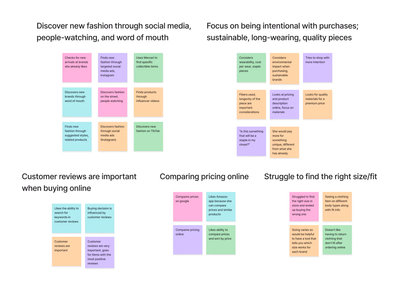
Many users struggle to determine fit/sizing for brands they are not familiar with
Users mainly discover new brands and products through social media influencers and targeted ads (Instagram, TikTok), as well as people-watching and word of mouth
There is a desire to be more intentional with purchases: “Is this something that will be a staple in my closet?”
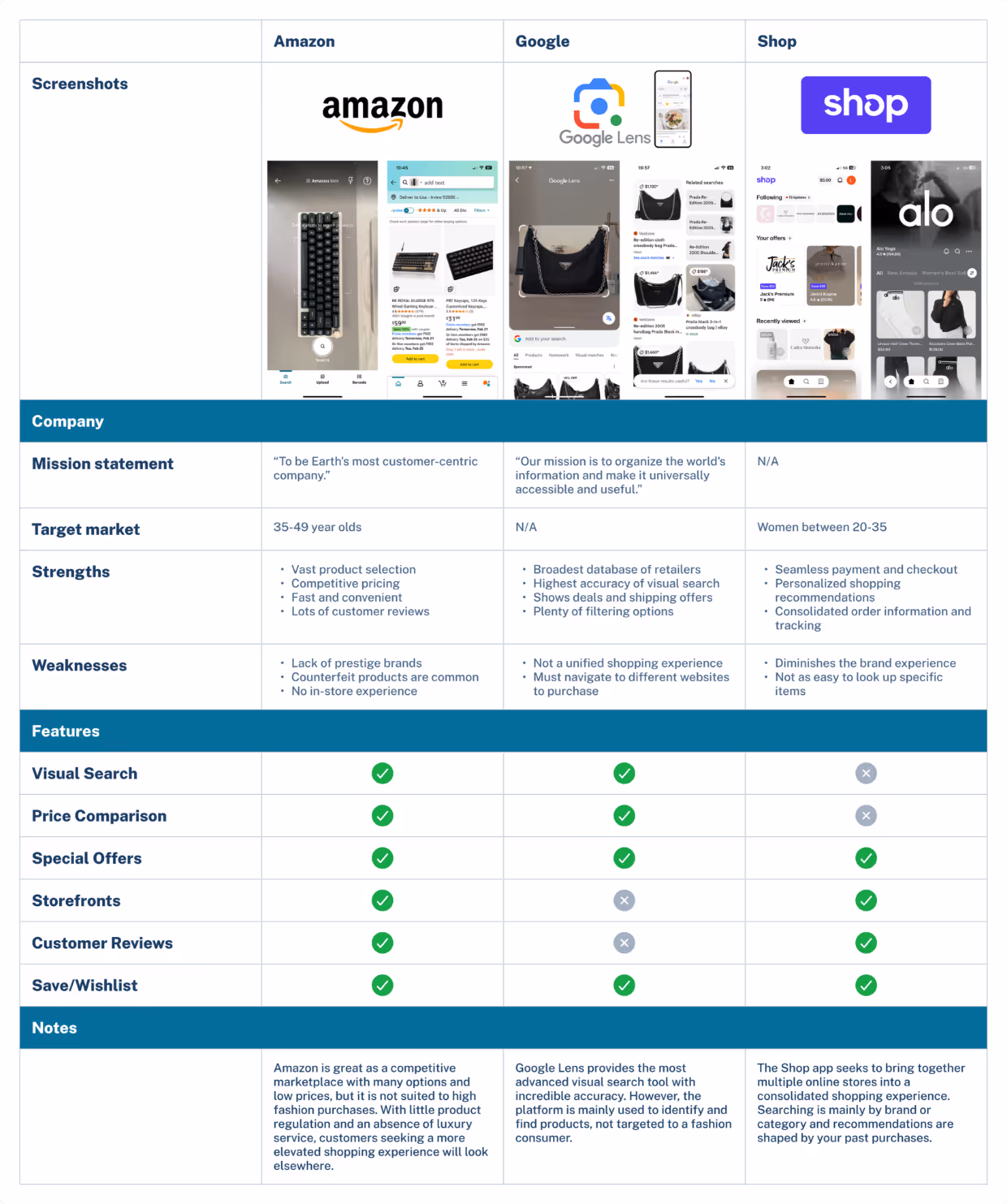
In light of these findings, I moved away from the idea of an app to be used to facilitate an in-store experience and instead identified the fashion discovery process as an area that could benefit from a new mobile app with tools designed for an easier user journey. I decided to perform a competitor analysis of brands offering a similar type of discovery tool and shopping experience.
I analyzed three shopping apps/tools which each have specific elements that they do particularly well: Amazon, which offers an extensive product catalog, Google Lens, which allows users to pull up product listings from a snapshot, and Shop, which consolidates various storefronts into a streamlined shopping experience.
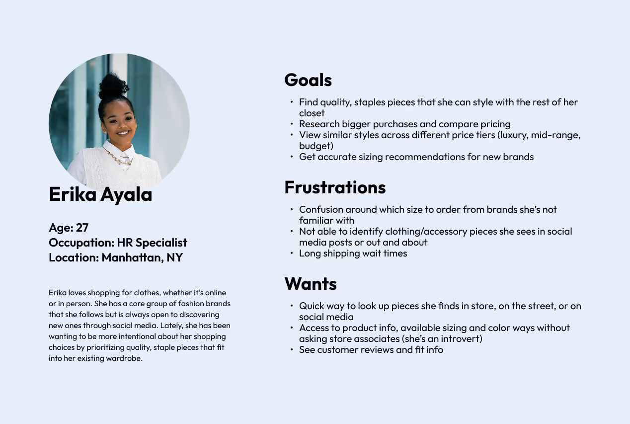
From these various research methods, I crystallized my user goals, needs, and frustrations into one primary persona who represents the target market I am designing for.
With this persona in mind, I narrowed the focus of my project to one POV and "How Might We" statement.
Since my time and resources for this project were limited, it was important to focus my efforts on building out a few features that would be the most impactful.

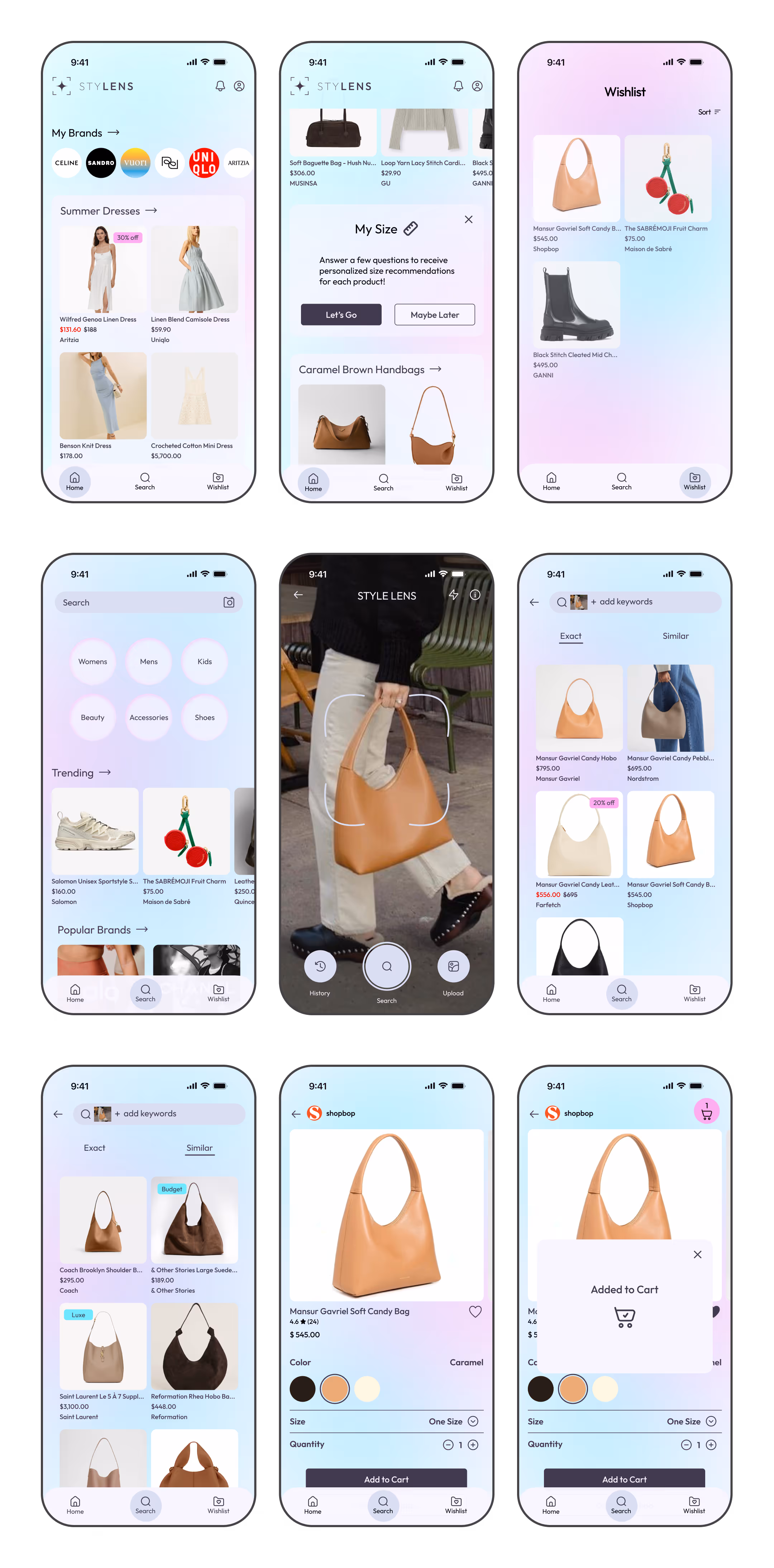
An AI-powered image search tool that allows users to find product matches directly from their camera or by searching pictures or screenshots from the camera roll.

A curated shopping feed of based on your past purchases, brands followed, and filtering preferences. The more you use the app, the better your recommendations become.

The user enters their body measurements, fit preferences, and typical sizes worn so that the app can make sizing suggestions for clothing items from unfamiliar brands.

A place to save products before committing to the purchase. Featuring price drop alerts.
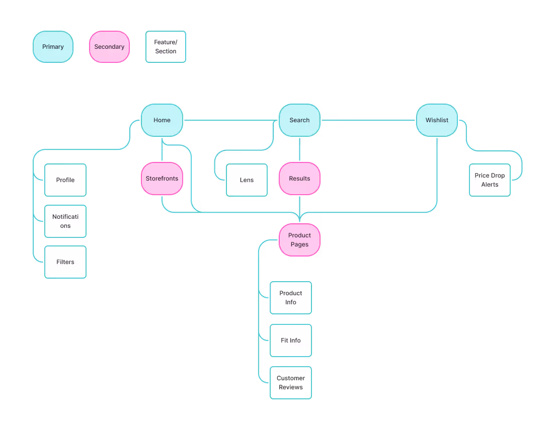
Based on the sitemap, I mapped out user flows for three of the core functionalities of the app: onboarding, identifying an item using the STYLENS visual search tool, and adding an item to the wishlist.

For the initial low-fidelity wireframes, I drew up rough sketches to get an idea of layout and organization. I then digitized these into a simple prototype so I could test it with a handful of users to get some feedback before proceeding further with the design.

In light of this feedback, I made the necessary revisions to improve the clarity and visual balance of the design for the high-fidelity wireframes.
Before jumping into high-fidelity, I needed to define the brand identity. I wanted the branding to have a modern, tech-forward feel with hints of playfulness.

I combined the words “style” and “lens” into a stylized wordmark, “STYLENS.” The logo image combines a camera viewfinder with a spark to symbolize the AI-powered visual search technology.
I chose a clean, round sans-serif font that felt modern with a touch of youthfulness.
The color palette features a bright turquoise and pink which will be applied in gentle washes in the background.
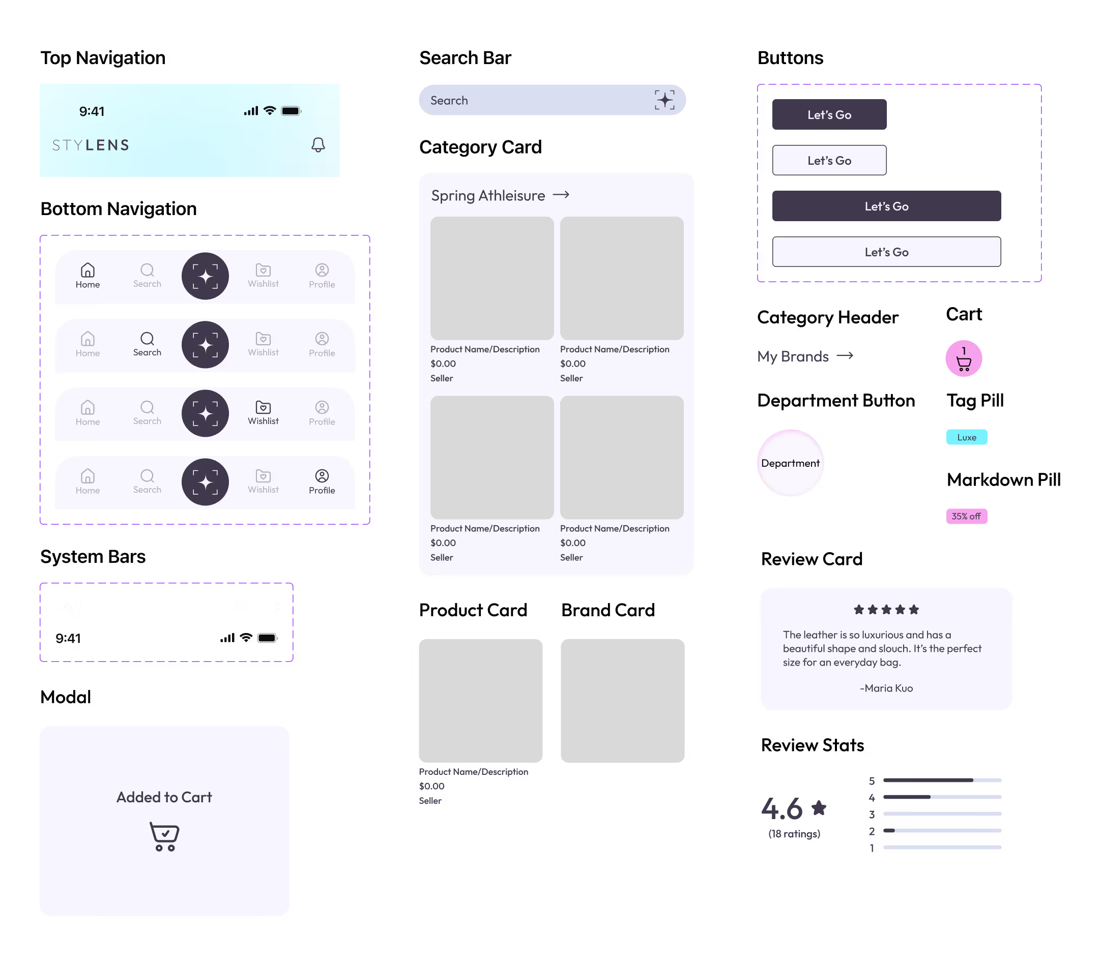
When I began constructing the hi-fi wireframes, I applied the brand style to each component to create a cohesive look and brand identity. This was the resulting UI kit.
For the high-fidelity wireframes, I built out two main user flows: 1. Conducting a visual search and adding the item to your wishlist, and 2. Finding the item in your wishlist and adding it to your cart to purchase.
I conducted usability testing with 5 participants over Zoom. They were asked to complete two tasks relating to the user flows along with more general questions about their thoughts on the design. This yielded some very useful insights.
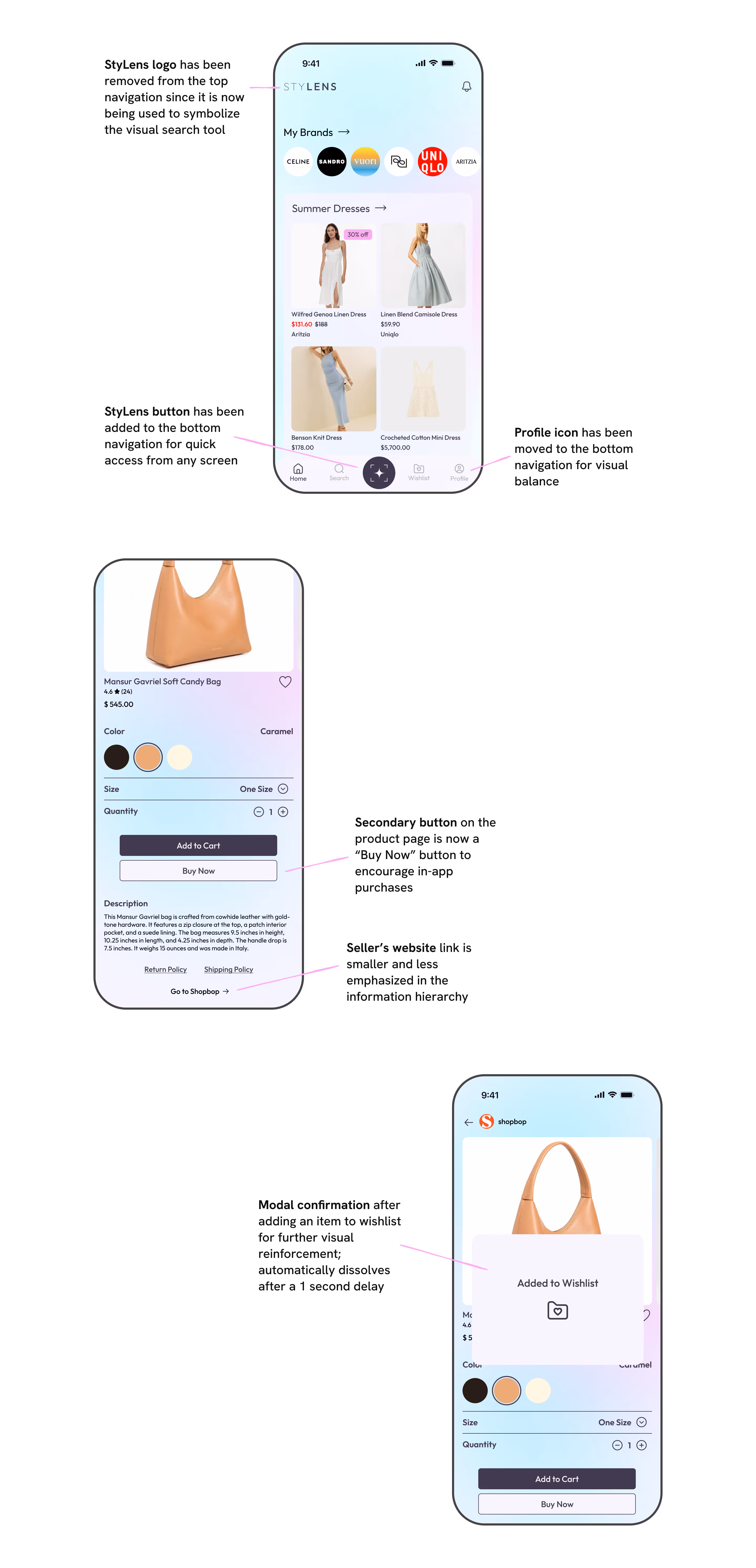
Based on the feedback from the usability testing, I decided to make a few high-priority revisions.
Listening to research: You can't assume what the problem is or what users want. Research will tell you where the friction actually lies.
Key features should be prominent: It was important for users to have quick access to the main tool, "Style Lens" from the home screen. Having it on a secondary screen felt "tucked away."
Information hierarchy influences behavior: One user made a key observation during usability testing—having a main button leading off the app would funnel traffic away from our checkout flow.
AI Styling: Further integrate AI technology to give the user smart styling suggestions for easy wardrobing.
AR (Augmented Reality) Try-Ons: Expand the Style Lens usability to AR applications to let users visualize products on themselves.
Brand Storefronts: To facilitate curated shopping experiences and open the door to future brand partnerships.